branding
Branding is so much more than just a logo: it’s the heart, soul and personality of your business. Every aspect must harmonise: how you present yourself to the outside world, your tone of voice, your ethical stance. Any inconsistency can compromise your hard-earned identity. We help you get – and keep – your act together!


The Implant Centre
A clear, modern identity where the single graphic tooth represents an implant completing the circle (i.e. a full set of teeth). A strong visual ‘house-style’ ties everything together and promotes brand recognition. The supporting tagline, ‘The art of dental confidence’, highlights the importance of restoring a patient’s confidence, and the artistry involved in the implant process that helps achieves this objective.
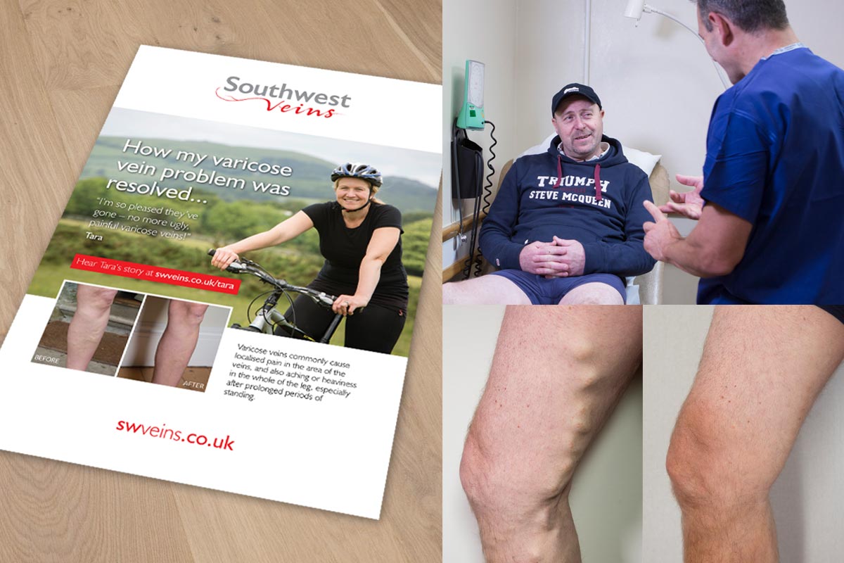
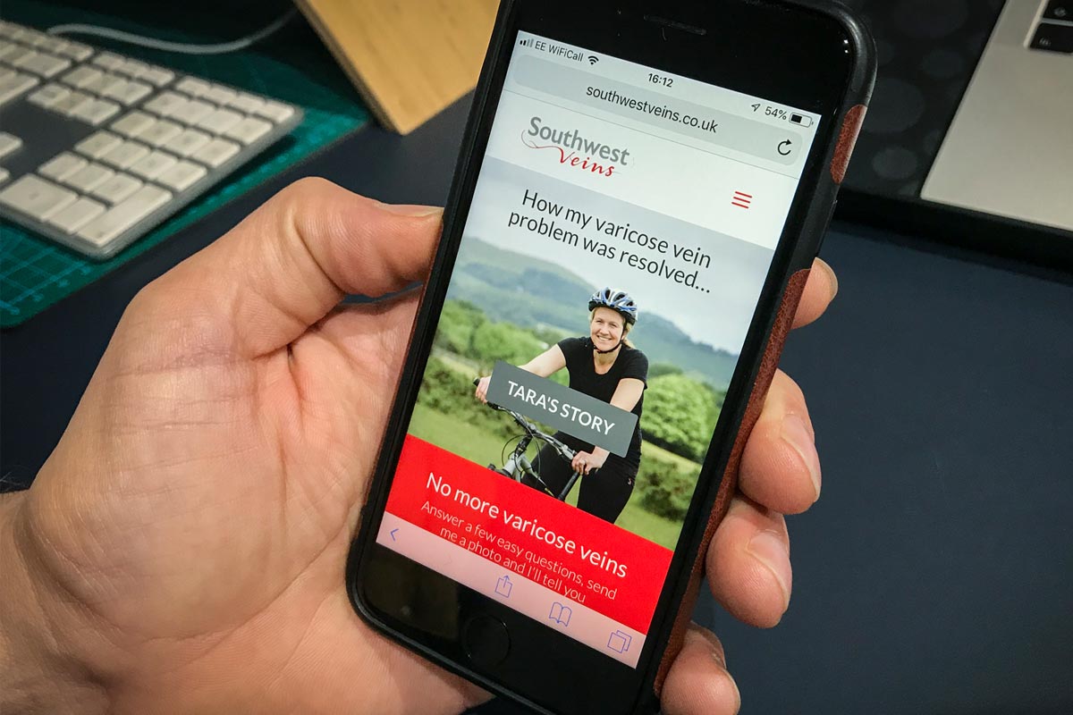
Southwest Veins
A clear, ‘does what it says on the tin’ identity with no need for a tagline. The creative ‘veiny’ typography employed on the word ‘veins’ really does explain everything, along with the clean, bold, blood-red visual house style.


John Tanous
A simple, elegant design incorporating a ‘JT’ icon that suggests an abstract carving, and a contemporary mustard colour hinting at the natural tones of wood. The tagline ‘Hand crafted furniture for life’ conveys the high level of skill involved in creating furniture made so well that it should last a lifetime, whilst also being beautifully functional for everyday living.


The Implant Experts
The owner of the practice has been placing implants – effectively in his own name – for over 25 years. But with its recent expansion and rapid evolution into a centre of excellence in implantology training and development, it was felt that a rebranding was warranted. Hence we created The Implant Experts identity and tagline ‘Life changing dentistry’. The implant graphic in the logo conveys an instant awareness that the business relates to teeth.