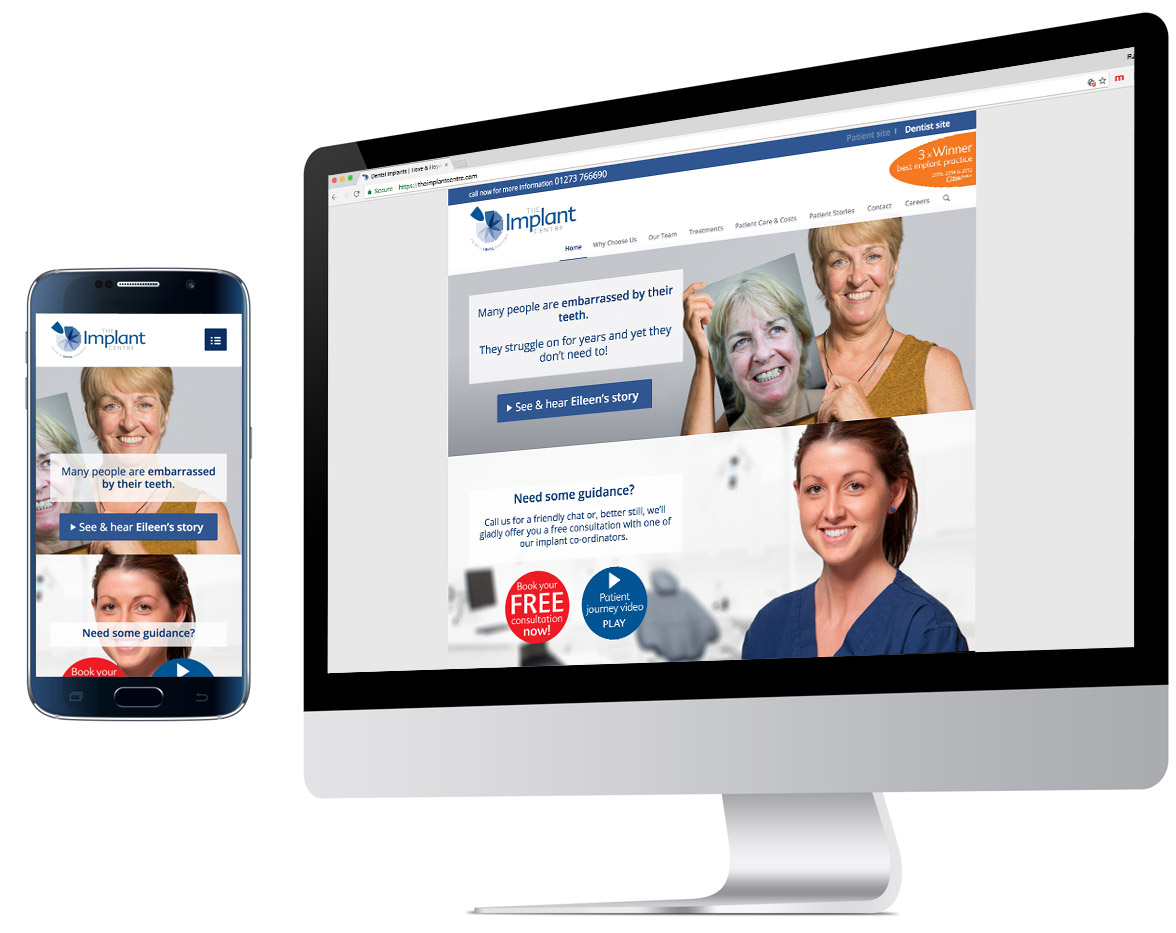
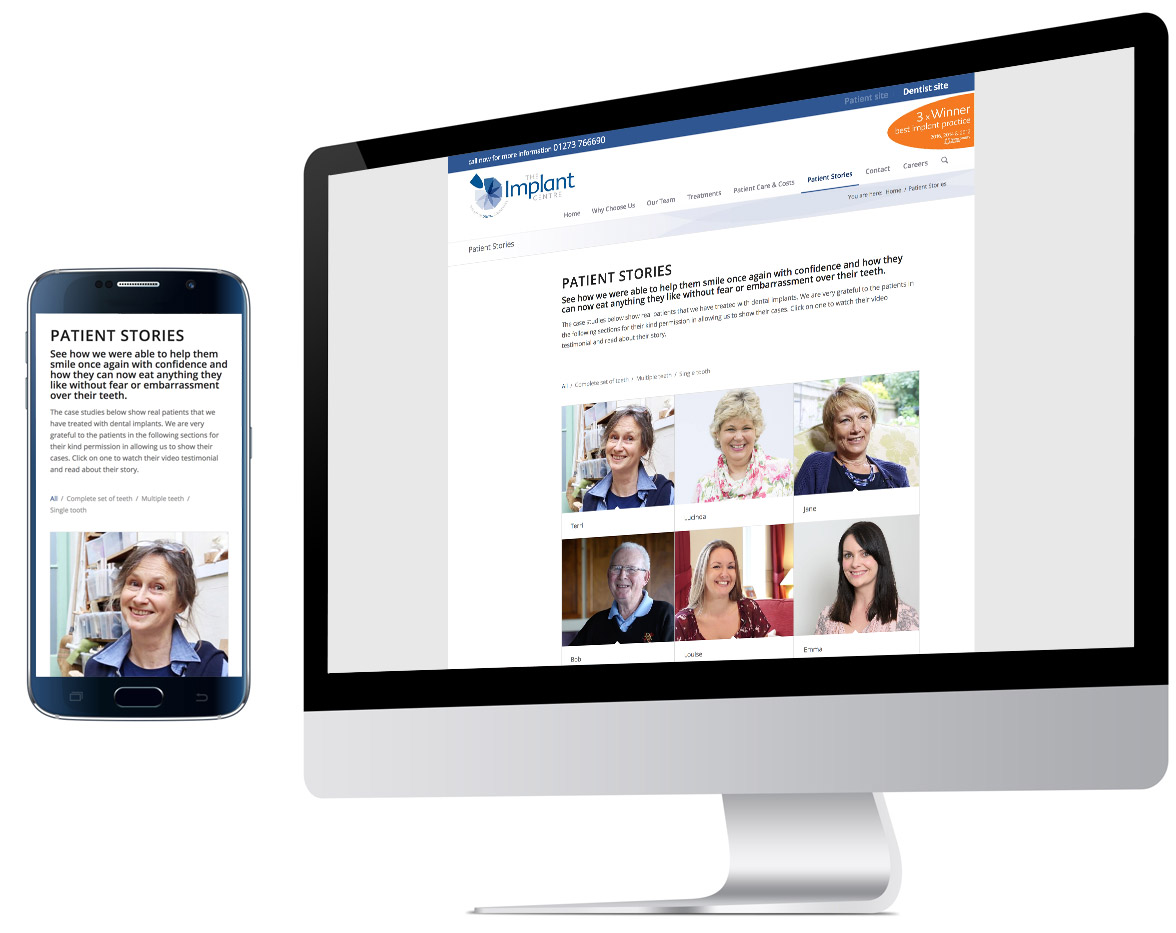
2 target markets – 2 websites in 1
We believe that the most elegant and effective way to engage two very different audiences – in this case, patients and referring dentists – is to address them separately, rather than risk a potentially watered-down compromise. But whilst there’s a clear difference in the tone of voice we use, there’s still a coherent branding and house style tying the two distinct elements together.


strong brand identity & house style
A clear, modern identity where the single graphic tooth represents an implant completing the circle (i.e. a full set of teeth). A strong visual ‘house-style’ ties everything together and promotes brand recognition. The supporting tagline, ‘The art of dental confidence’, highlights the importance of restoring a patient’s confidence, and the artistry involved in the implant process that helps achieves this objective.

“Rupert’s dynamic creative flair and professionalism has created a coherent marketing strategy and portfolio – for both patients and referring dentists – that has transformed The Implant Centre into its current award-winning shape.”
Bill Schaeffer
Founder & Implant Surgeon
The Implant Centre


winners deserve to be recognised
Being recognised by your industry as ‘the best in the UK’ the three times you’ve entered the awards is something worth shouting about! The vivid orange flash, echoing the stylised tooth in the logo, achieves this dramatically whilst still complementing the overall house-style of The Implant Centre. We have utilised it (in this case on a homepage banner) throughout their marketing portfolio.
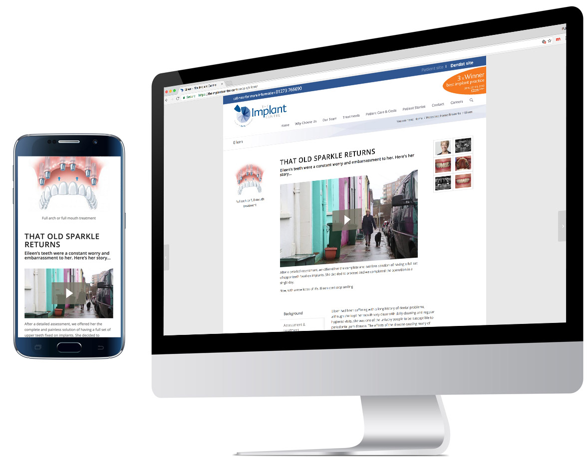
videos work!
Video is increasingly becoming the medium of choice for getting a key message across in a website. Whether it be an emotive, life-changing patient story like Eileen’s, or an informative ‘treatment journey’ that helps put prospective patients at ease.


